Icon
Used for rendering icons
import { Icon } from 'react-native-magnus'

<Icon name="like1" color="blue700" fontSize="title" />
<Icon
  name="star"
  color="yellow700"
  fontSize="6xl"
  fontFamily="FontAwesome"
/>
<Icon name="codesquare" color="red500" fontSize="6xl" />
<Icon name="android1" color="teal500" fontSize="6xl" />
<Icon name="heart" color="red500" fontSize="6xl" />
<Icon name="apple1" color="blue700" fontSize="6xl" />
<Icon name="appstore1" color="teal500" fontSize="6xl" />
<Icon name="slack" color="yellow700" fontSize="6xl" />
We are using react-native-vector-icons behinds the scene.
Example #1
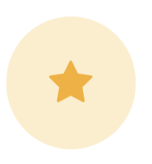
<Icon
  bg="yellow400"
  p={20}
  rounded="circle"
  name="star"
  color="yellow700"
  fontSize="xl"
  fontFamily="FontAwesome"
/>
Props
| Property | Description | Type | Default |
|---|---|---|---|
| m | margin | string | number |
- |
| mt | margin top | string | number |
- |
| mr | margin right | string | number |
- |
| mb | margin bottom | string | number |
- |
| ml | margin margin left | string | number |
- |
| mx | margin horizonal | string | number |
- |
| my | margin vertical | string | number |
- |
| p | padding | string | number |
- |
| pt | padding top | string | number |
- |
| pr | padding right | string | number |
- |
| pb | padding bottom | string | number |
- |
| pl | padding margin left | string | number |
- |
| px | padding horizonal | string | number |
- |
| py | padding vertical | string | number |
- |
| h | height | number |
- |
| w | width | number |
- |
| bg | background color | string |
- |
| minH | mininmum height | number |
- |
| minW | minimum width | string |
- |
| rounded | border radius | string | number |
none |
| roundedTop | border radius top | string | number |
none |
| roundedBottom | border radius bottom | string | number |
none |
| roundedLeft | border radius left | string | number |
none |
| roundedRight | border radius right | string | number |
none |
| borderColor | color for border | string |
- |
| borderTopColor | color for border top | string |
- |
| borderRightColor | color for border right | string |
- |
| borderLeftColor | color for border left | string |
- |
| borderBottomColor | color for border bottom | string |
- |
| borderWidth | width for border | number |
- |
| borderTopWidth | width for border top | number |
- |
| borderRightWidth | width for border right | number |
- |
| borderLeftWidth | width for border left | number |
- |
| borderBottomWidth | width for border bottom | number |
- |
| flex | flex property for container | number |
- |
| shadow | describe the depth of shadow to be used | number |
- |
| shadowColor | color for shadow | string |
- |
| fontFamily | name of the font family for icon | string |
AntDesign |
| fontSize | fontSize for icon | string |
md |
| name | name of icon | string |
- |
| color | icon color | string |
gray500 |
| position | used to position the childrens | absolute" | "relative" |
relative |
| top | number of logical pixels to offset the top edge of this component. | number |
- |
| right | number of logical pixels to offset the right edge of this component. | number |
- |
| bottom | number of logical pixels to offset the bottom edge of this component. | number |
- |
| left | number of logical pixels to offset the left edge of this component. | number |
- |
| opacity | opacity | number |
- |