Header
A custom component for rendering a header at the top of the screen
Center Aligned
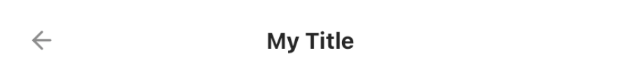
<Header
  p="lg"
  borderBottomWidth={1}
  borderBottomColor="gray200"
  alignment="center"
  prefix={
    <Button bg="transparent">
      <Icon name="arrow-left" fontFamily="Feather" fontSize="2xl" />
    </Button>
  }
>
  My Title
</Header>
Left Aligned
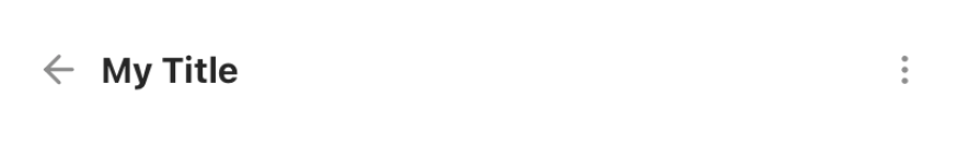
<Header
  p="lg"
  alignment="left"
  prefix={
    <Button bg="transparent">
      <Icon name="arrow-left" fontFamily="Feather" fontSize="2xl" />
    </Button>
  }
  suffix={
    <Button bg="transparent">
      <Icon name="more-vertical" fontFamily="Feather" />
    </Button>
  }
>
  My Title
</Header>
Props
| Property | Description | Type | Default |
|---|---|---|---|
| m | margin | string | number |
- |
| mt | margin top | string | number |
- |
| mr | margin right | string | number |
- |
| mb | margin bottom | string | number |
- |
| ml | margin margin left | string | number |
- |
| mx | margin horizonal | string | number |
- |
| my | margin vertical | string | number |
- |
| p | padding | string | number |
- |
| pt | padding top | string | number |
- |
| pr | padding right | string | number |
- |
| pb | padding bottom | string | number |
- |
| pl | padding margin left | string | number |
- |
| px | padding horizonal | string | number |
- |
| py | padding vertical | string | number |
- |
| h | height | number |
- |
| w | width | number |
- |
| bg | background color | string |
- |
| minH | mininmum height | number |
- |
| minW | minimum width | string |
- |
| bgImg | background image | ImageSourcePropType |
- |
| bgMode | resize mode for background image | "contain" | "cover" | "stretch" |
cover |
| rounded | border radius | string | number |
none |
| roundedTop | border radius top | string | number |
none |
| roundedBottom | border radius bottom | string | number |
none |
| roundedLeft | border radius left | string | number |
none |
| roundedRight | border radius right | string | number |
none |
| borderColor | color for border | string |
- |
| borderTopColor | color for border top | string |
- |
| borderRightColor | color for border right | string |
- |
| borderLeftColor | color for border left | string |
- |
| borderBottomColor | color for border bottom | string |
- |
| borderWidth | width for border | number |
- |
| borderTopWidth | width for border top | number |
- |
| borderRightWidth | width for border right | number |
- |
| borderLeftWidth | width for border left | number |
- |
| borderBottomWidth | width for border bottom | number |
- |
| flex | flex property for container | number |
- |
| row | makes flex direction to row when true |
boolean |
- |
| shadow | describe the depth of shadow | number |
- |
| shadowColor | color for shadow | string |
- |
| justifyContent | describes how to align children within the main axis of their container | "flex-start"| "flex-end" | "center" | "space-between" | "space-around" | "space-evenly" |
- |
| alignItems | describes how to align children along the cross axis of their container | "flex-start" | "flex-end" | "center" | "stretch" | "baseline"; |
- |
| flexDir | controls the direction in which children of a node are laid out | "row" | "column" | "row-reverse" | "column-reverse"; |
column |
| flexWrap | controls what happens when children overflow the size of the container along the main axis | "wrap" | "nowrap" | "wrap-reverse"; |
nowrap |
| position | used to position the childrens | absolute" | "relative" |
relative |
| top | number of logical pixels to offset the top edge of this component. | number |
- |
| right | number of logical pixels to offset the right edge of this component. | number |
- |
| bottom | number of logical pixels to offset the bottom edge of this component. | number |
- |
| left | number of logical pixels to offset the left edge of this component. | number |
- |
| opacity | opacity of div | number |
- |
| alignSelf | alignment for the selected item inside the flexible container. | 'auto' | 'flex-start' | 'flex-end' | 'center' | 'stretch' | 'baseline' |
- |
| overflow | controls how children are measured and displayed | "visible" | "scroll" | "hidden" |
hidden |
| suffix | Renders a component on the right | ReactNode |
- |
| prefix | Renders a component on the left | ReactNode |
- |