How to build Theme Switcher in React Native with Magnus
Giving your users an ability to change the theme has become a necessity nowadays. Every site is now providing a way to allow users to change the theme according to there mood.
In this guide, I will show you how to make Theme Switcher in your React Native app using Magnus UI.
Installing
First, we will install the react-native-magnus library.
yarn add react-native-magnusMagnus also uses many third-party libraries. So you will need to install them as well.
yarn add color react-native-animatable react-native-modal react-native-vector-iconsAfter you are done installing the packages, make sure you install pods.
cd ios && pods installBasic Setup
Wrap your root component in Provider from react-native-magnus.
// App.js
import React from "react";
import { ThemeProvider } from "react-native-magnus";

const App = () => {
  return <ThemeProvider>// our app goes here</ThemeProvider>;
};

export default App;
ThemeProvider is basically using ContextAPI under the hood to provide the theme to all nested components.
Adding theme
So our basic setup is out of the way, let’s create the custom themes that we will in our app.
// constants/themes.js

const THEMES = {
  light: {
    name: "light",
    colors: {
      body: "#fff",
      button: "#3087e8",
    },
  },
  dark: {
    name: "dark",
    colors: {
      body: "#000",
      button: "#e83045",
    },
  },
};

export default THEMES;
We need to make sure our ThemeProvider in index.js is using the light theme by default. That can be done by simply passing the theme prop to ThemeProvider.
// App.js

import React from "react";
import THEMES from "./constants/themes";
import { ThemeProvider } from "react-native-magnus";

const App = () => {
  return (
    <ThemeProvider theme={THEMES.light}>      <></>
    </ThemeProvider>
  );
};

export default App;
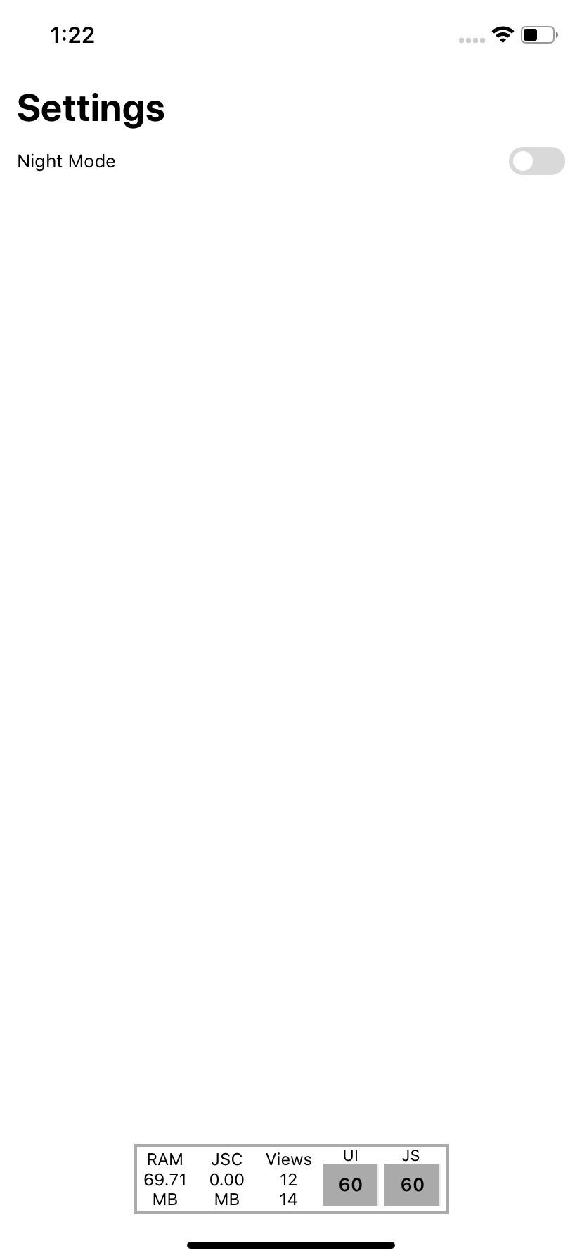
Ok, now it’s time to build the Theme Switcher. Let’s add a basic layout.
// App.js

import React from "react";
import { ThemeProvider, Text, Div } from "react-native-magnus";

import THEMES from "./constants/themes";
import ThemeSwitcher from "./components/ThemeSwitcher";

const App = () => {
  return (
    <ThemeProvider theme={THEMES.light}>
      <Div bg="body" flex={1} px="lg">        <Text mt="2xl" pt="xl" fontSize="5xl" color="text" fontWeight="bold">          Settings        </Text>        <Div row mt="md">          <Div flex={1}>            <Text color="text">Night Mode</Text>          </Div>          <Div>            <ThemeSwitcher />          </Div>        </Div>      </Div>    </ThemeProvider>
  );
};

export default App;// components/ThemeSwitcher.js
import React, { useContext } from "react";
import { Toggle, ThemeContext } from "react-native-magnus";
export default function ThemeSwitcher() {
return <Toggle />;
}
Div and Text are components that are provided by Magnus. Notice how easily we are setting the background color of Div component by using bg prop. This is being done by Magnus internally. Magnus is transforming our theme values and applying them to these components ‘style.
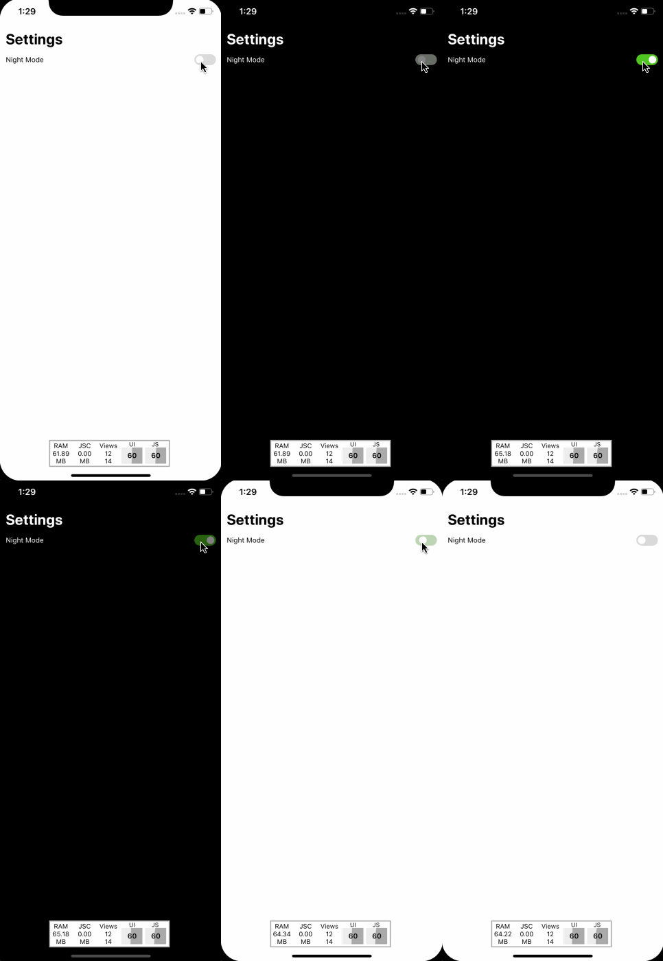
Now we need to change our theme when the user presses the toggle button. As I previously said, ThemeProvider is basically using ContextAPI. Magnus also exposes the ThemeContext if we ever need to change the theme or need the current theme values.
// components/ThemeSwitcher.js
import React, { useContext } from "react";
import { StatusBar } from "react-native";
import { Toggle, ThemeContext } from "react-native-magnus";

import THEMES from "../constants/themes";

export default function ThemeSwitcher() {
  const { theme, setTheme } = useContext(ThemeContext);

  /**
   * changes the theme on toggle press
   * if the theme is dark, set theme to light
   * else to dark
   */
  const onToggle = () => {
    if (theme.name === "dark") {
      setTheme(THEMES.light);
      StatusBar.setBarStyle("dark-content");
    } else {
      setTheme(THEMES.dark);
      StatusBar.setBarStyle("light-content");
    }
  };

  return <Toggle on={theme.name === "dark"} onPress={onToggle} />;
}
Explanation
- We are grabbing the current and setTheme function from ThemeContext by using useContext hook.
- When the user presses the Toggle button, we are checking the current theme name and changing the theme accordingly using the setTheme function we received from ThemeContext.
- Notice how we are also changing StatusBar barStyle.
Feel free to check the full source code 💻on GitHub
Copyright © Magnus UI 2020

